An event page is not an event brochure. It is a sales page.
The distinction matters because brochures are designed to inform. Sales pages are designed to convert. A brochure describes. A sales page answers objections, builds desire, presents a clear offer, and removes every friction point between interest and purchase. Most event pages are designed like brochures and perform like brochures: they inform the people who were going to buy anyway and fail to persuade the much larger group of people who were interested but undecided.
Converting undecided visitors into buyers is where the commercial leverage in event page design sits. A visitor who arrived on your page already convinced to buy would have bought regardless of what the page looked like. A visitor who arrived curious but uncommitted is the one you either capture or lose based on how well the page does its job.
The title decides whether they read anything else
The event page title carries more weight than any other single element because it is the first thing every visitor reads, and for visitors arriving through search, it determines whether they click at all. A title that communicates the event name, type, and location immediately tells the visitor whether this is relevant to them. A title that is clever but unclear does the opposite.
Compare "Acoustic Nights at The Forum" (clear: what, where) with "An Evening of Sound" (unclear on all dimensions). Both might describe the same event. Only one communicates it at first glance. For search discoverability, specificity is also important: a title that matches how your potential audience would search for this type of event in this location is a title that will surface in relevant results.
For recurring events, include the edition or date to distinguish this listing from past ones that might appear in search. For one-off events with a specific theme or occasion, include that context: "Annual Summer Fundraiser Gala (Third Edition)" is more persuasive than "Gala Dinner" because the annual framing implies an established event with a proven track record.
Writing a description that does the selling
Most event descriptions describe the event. The best ones answer the visitor's actual decision question: should I spend time and money on this over everything else I could do instead?
A high-performing description covers these elements in roughly this order: what happens (be specific, not atmospheric); who it is for (give the visitor a mirror to see themselves in); what is included in the ticket price (eliminate uncertainty about what they are paying for); where it is and how to get there (transport links, parking, the specific address); any practical requirements (age, dress code, what to bring); and the refund policy (reduce the perceived risk of committing). This is not a creative writing exercise. It is a Q&A exercise: every common question your potential buyers have should be answered before they need to ask it.
The length should match the complexity of the event and the price point. A free community gathering needs fewer words than a paid multi-day conference. But the principle is the same: every sentence should serve the conversion goal. A paragraph that describes the atmosphere without answering a practical question is a paragraph that could be replaced with something more useful.
Imagery that builds trust and creates desire
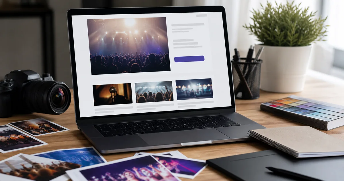
The header image on your event page is the first visual impression and the element most directly responsible for whether the description gets read at all. A strong image makes visitors feel they already know what attending this event is like. A weak image or a generic graphic makes the page feel unmemorable before they have read a word.
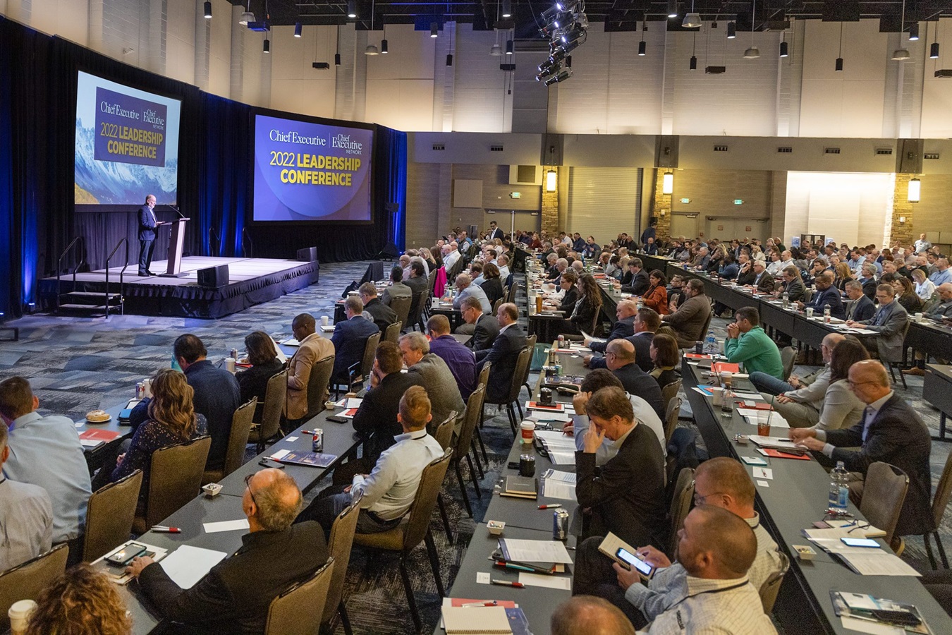
For events with a physical venue, a photo from inside the venue at a previous event is almost always the most effective image available. It shows a real crowd in a real space, which is the exact information a prospective attendee is trying to assess when they visit your page. Past event photography is a worthwhile investment for any event you intend to run more than once.
For first-time events, a clean, high-quality image of the venue itself, or a professional photo of the key performer or speaker, is the best available alternative. Whatever you use, ensure the image works at the dimensions the platform displays it in and that the most important content in the image is not cropped at those dimensions. Most visitors will see the page on a phone, and a landscape image designed for a desktop header will crop unpredictably on a narrower screen.
Social proof: the evidence that other people already decided to come
A visitor who is undecided about attending is looking for signals that other people have already made the decision in their favour. Social proof provides those signals. It does not need to be elaborate to work: a visible ticket sales counter showing 180 tickets sold, a brief quote from a past attendee, a line noting that last year's event sold out, or the names of speakers or performers your audience already recognises all function as social proof.
The strongest social proof is genuine demand. "Only 40 tickets remaining" is persuasive precisely because it implies that 160 people already committed. "Tickets selling fast" without any specific evidence is persuasive to no one. Use real numbers wherever you have them, because a specific figure is more credible than a vague claim.
Structuring your ticket section for clarity and conversion
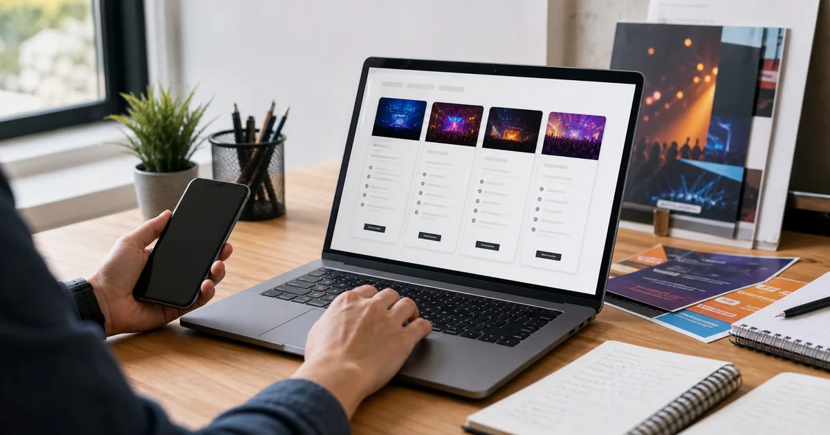
The ticket section should appear early on the page, not at the bottom. A visitor who is ready to buy should not have to scroll through the entire event description before finding the purchase option. Placing the ticket widget in a position that is visible on first load, or easily reached with a single scroll, removes one of the most avoidable friction points in the checkout journey.
Each ticket tier should have a name that tells the buyer exactly what they are getting and a description that differentiates it clearly from other tiers. "Early Bird (limited to 100 tickets)" is more informative than "Early Bird." "VIP (includes reserved front-row seat and post-show meet-and-greet)" is more informative than "VIP Ticket." The buyer should be able to choose their tier confidently based on the information in the ticket section without needing to scroll back to the event description to understand what each includes.
Mobile experience: where most of your buyers actually are
The majority of ticket purchases happen on mobile devices. This means your event page is, in practice, a mobile page that also works on desktop, not the reverse. Every design decision you make about layout, image, text length, and button placement should be evaluated first on a phone screen.
Key mobile checks before going live: does the header image display well at phone screen proportions? Is the ticket section visible without excessive scrolling? Does the checkout process work smoothly on a phone keyboard? Does the event description read easily at mobile font sizes? A page that works perfectly on a desktop and poorly on a phone will lose the majority of its potential buyers before they reach checkout.
Testing your page before you share it
Before sharing your event page with your audience, read through it as if you are a prospective attendee who knows nothing about the event. Does it answer: what is this event; is it for me; what do I get for my ticket; how do I get there; and what happens if I need a refund? If any of these questions is unanswered, the page is incomplete.
Share a preview link with two or three people who represent your target audience and ask them specifically: is there anything unclear, and is there anything missing that would help you decide to buy? Their feedback on a draft page will identify gaps that you are too close to the event to notice yourself. The five minutes this takes is among the highest-return preparation actions available before the event goes on sale.
What to do after the page is live
Most organizer attention to the event page is front-loaded: effort goes into creating it, and once it is published the page is treated as a fixed asset rather than a working document. The organizers who consistently improve their conversion rates over time treat the page differently. They check it periodically during the sales period, update it with new information as it becomes available, and use social proof additions to keep the page current and compelling.
Adding social proof to a page that is already live is one of the highest-leverage activities during the mid-campaign period. A page that showed no social proof on launch day and now shows 180 tickets sold is a different page for the visitor who arrives two weeks into the campaign. The running count of buyers is not marketing copy. It is real, observable evidence of demand that converts undecided visitors more reliably than almost any other element on the page.
Review the event description once after you have started receiving enquiries from potential buyers. Every question you receive by email or social message is a question that was not answered on the page. Add the answer to the description. A description that grows progressively more complete through the campaign period gets better at converting over time, because it reflects the real questions real buyers are asking rather than the theoretical questions you anticipated when you first wrote it.
For recurring events, keep a document of every improvement you made to the event page during the sales campaign. The next edition starts from a better baseline, and the accumulated knowledge of what worked does not need to be reconstructed from scratch each time. The most successful recurring event promoters have event page templates that encode years of conversion knowledge, which means each new edition launches stronger than the last without requiring the same discovery process to be repeated.
The final check before you promote: open your event page on a phone with fresh eyes and ask whether you would buy a ticket based on what you see. If the answer is yes immediately, it is ready. If anything makes you pause, that pause is what your undecided buyers will feel. Fix it before the first visitor arrives.